


As I've said over on my Work in Progress thread at Librarium Online, I really didn't enjoy painting these Ravenwing very much. I guess for some reason I'm just not as happy with the finished result as I was with my previous stuff. This in itself is quite amusing, because I know full well I would have been chuffed to churn these models out only a year ago. I guess its a nice indication of progress!
Perhaps I need to leave them for a while and come back to them. I always find that helps when evaluating your work.
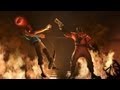
But, before I tell you what I think did and didn't work on these models, here are some pictures so you can tell me yourself:


I had some issues with the lights on the front of the bikes, they all came out looking dirty and of a mixed shade. I'm also not 100% on the highlighting, I can't decide if it looks too bold. Finally the white caused me no end of anguish, and is quite blotchy in parts.
However, I've learned a good technique for leather, and I do love the pose on the Attack Bike. Ultimately they are playable, which is what I'm going for. I'm also lucky I only have 3 more bikers and the Landspeeder to do - thank god the Deathwing element of the DA appealed to me more!
Its been a real push to get these models finished within the time limit and this blog has been a bit neglected because of it. Look forward to a few new posts before this month is through, including a product review and a showcase of some custom made models.
As always I would love to know what you think! Thanks for stopping by...


.JPG)

6 comments:
Mate - these are great!
The SM bike models are a pain to paint, and painting ANY white absolutely blows, so I think you've done a grand job.
Subtle.
- Drax.
I gotta agree with Drax, these guys look damn cool, and Marine bikes are beast to paint. Heck even assembling them well can be a pain at times.
It might just be the photos but the black highlight doesn't look pronounced enough to me.
Overall, I think they're better than tabletop quality. They're nice and clean and based.
I agree with Ron, and Drax, and Vredesbyrd! These are definitely notches higher than tabletop quality. The black highlighting doesn't picture as bold as you seem to think, though I wouldn't quite say they're not pronounced enough since I lean towards subtle highlights.
Great job!
What is the technique for leather you mentioned? What a tease. *-)
Well, thanks one and all. I almost feel sheepish for saying I don't like them! I'll have to go an reconsider them...
This is the awesome thing about blogging. At the moment I'm hardly seeing any fellow gamers so I don't get anybody to show my work too. Thats where you lovely chaps come in! You couldn't ask for a nicer audience.
Like Malthus I like a subtle highlight, so I think thats what got me about these. Shadow Grey on Chaos Black just takes some getting used to.
Vredesbyrd: I had forgotten how bad the bike models are! That join along the middle is almost impossible to get right. This is the one reason I'm glad the 'wing are black - any miss joins show up less.
Zarelexis: I'm not at home at the moment, but I'll check what paints I used for the leather when I get back mate.
Post a Comment